
Design for Engagement in Unilever's ReGenerate Concept
Introduction:
In the complex landscape of delivering information effectively, my role revolves around ensuring the right content is presented at the right time, discerning what truly matters from what does not. This case study delves into my involvement with Unilever's ReGenerate concept, where through user testing and collaboration, I unveiled the potential of connecting vital components that initially remained obscured.
Challenge:
Unilever's ReGenerate concept carried a substantial challenge – effectively communicating its value to users. Despite extensive testing with users and colleagues, the true worth of the concept remained concealed, leading to confusion and uncertainty. The task was to make the core elements of the concept comprehensible and aligned with users' needs.
Solution:
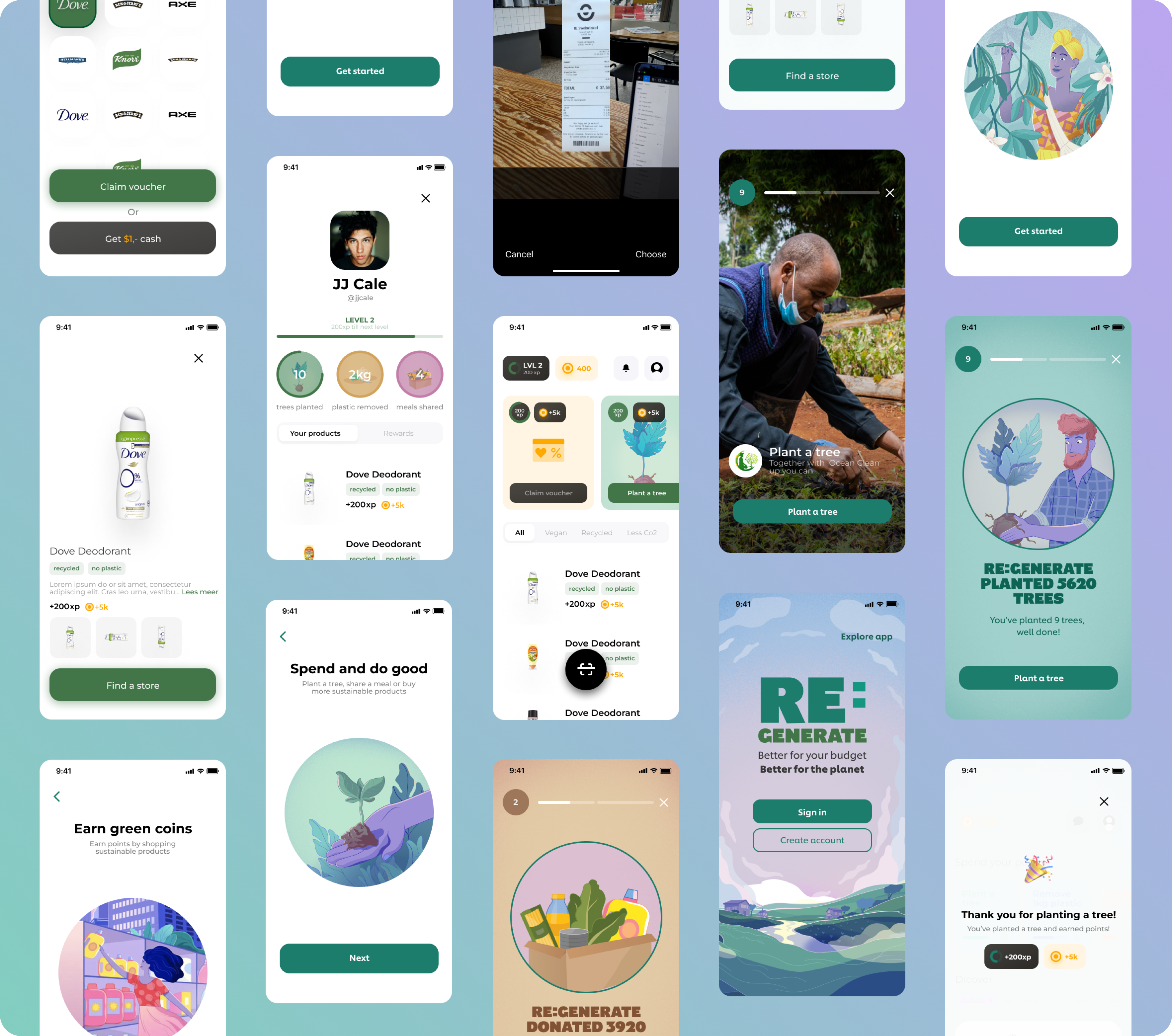
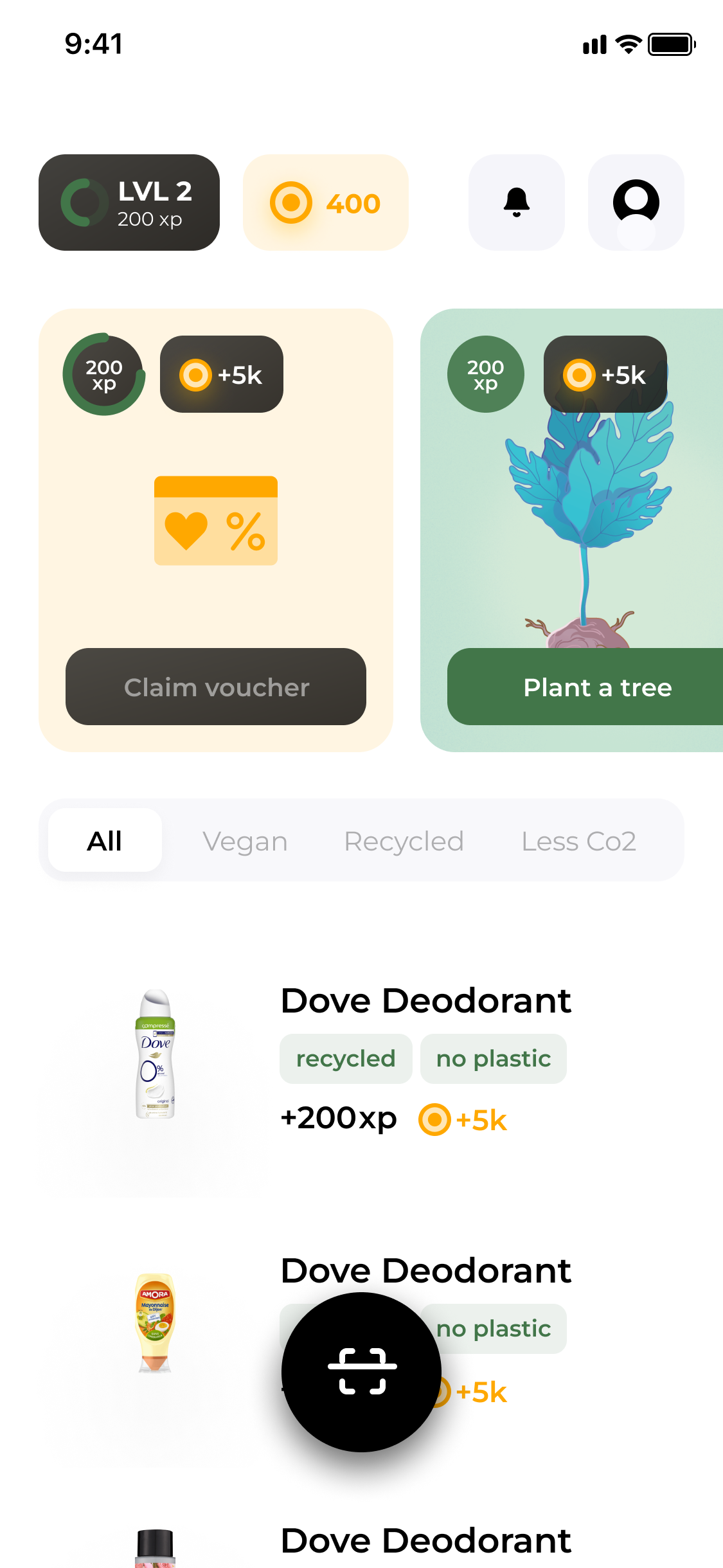
By deciphering the intricate user journey and identifying the pivotal touchpoints, I conceptualized a solution that would unravel the hidden value within ReGenerate. This solution revolved around repositioning the coupons and rewards—two fundamental components—onto the homescreen of the application. The aim was to establish a clear connection between these two elements and empower users with a more intuitive experience.
Approach:
Investigate: The journey commenced with a comprehensive investigation into the underlying data. Scrutinizing customer service notes and engaging stakeholders offered insights into the complexity of the challenge. Additionally, conducting a Design Sprint involving users revealed firsthand insights into the concept's perceived value. This phase was further enhanced by studying successful examples of similar solutions.
Plan: With data in hand, the planning phase involved setting long-term goals and plotting detailed user stories and flows. A comprehensive flowchart depicted the intricate pathways users might encounter, forming a crucial foundation for the design process.
Explore: This phase unleashed creative exploration to craft a system that holistically made sense to users. The objective was to create a design that inherently communicated its purpose and value, providing users with an immediate understanding.
Communicate: Effective communication emerged as the cornerstone, transitioning intricate data into user-friendly interactions. Understanding the user's language and perspective was paramount in this phase.
Outcome:
The transformation was remarkable. Previously, the core value was obscured and disconnected, represented by a hidden blue dot. By reimagining the interface and bringing the coupons and rewards to the homescreen, the app's real value became apparent. Users could now grasp the connection between these two essential components. What might appear intuitive now was a transformation from a convoluted path to clarity.
Conclusion:
The project exemplifies the power of strategic design thinking in translating complex concepts into intuitive, user-centered experiences. Unveiling the core value within Unilever's ReGenerate concept required breaking down barriers between components and aligning them with users' perceptions. This endeavor showcases the vital role of effective communication and the ability to see beyond the surface, ultimately enhancing engagement and comprehension.
Activities:
• Development and Refinement of Design System
• Wireframing and Conceptualization
• Rigorous User Testing and Validation
• Meticulous User Interface Design
• Iterative Prototyping for Continuous Improvement
• Recruitment, Onboarding, and Mentorship of UX Designers
How it was:
The blue dot represents the real value and as you can see it’s hidden.

My Design:

First, everything was designed around planting trees. Although the actual product was not about that. It was about connecting rewards with using coupons. So by presenting the coupons combined with the rewards our system started to make more sense. Now you can see that the two have something to do with eachother. It seems very logical now but they were on an entire different route before I came along. It can be quite hard for teams to step back and see that what they are building is not a marketing ad. No its software. Software that makes your life easier. User don’t want to sit and read about all your text. They want to do something.

Het Process
Er speelde enorm veel belangen bij het platform. Waren het niet de partners zelf was het wel het management team. Maar je komt nergens als je iedereen tevreden wilt stellen.
A. Investigate.
Dus daarom is het altijd verstandig om te beginnen met data! Wat voor data is er allemaal? Wat bij deze opdracht goed hielp was om alle notities van de klantenservice door te lezen. Er was namelijk al zo veel. Vervolgens interviewde ik de stakeholders en uiteindelijk in een Design Sprint de klant zelf. Daarnaast was ik ook bezig om te kijken of ik goede voorbeelden kon vinden van oplossingen die dit op een succesvolle manier weten op te lossen.
B. Plan.
Bij deze fase was ik bezig met het stellen van een langer termijn doel en het plotten van user stories en user flows wat uitliep in een giga flowchart van waar de gebruiker allemaal wel niet mee te maken krijgt. Dit is altijd zo enorm belangrijk.
C. Explore.
Hier mag mijn creativiteit altijd eventjes helemaal los en los ging ik. Ik wilde namelijk de gebruiker op de meest efficiëntste manier tot dienst zijn. Ik zocht naar een systeem wat in zijn geheel klopt. Wat voor de gebruiker in 1 opslag duidelijk is omdat het design voor zichzelf spreekt.
D. Communicate
Communicatie is het aller belangrijkste onderdeel van het geheel. Uiteindelijk is Design communicatie van vrij complexe cijfertjes naar een knop waarmee je communiceert. Maar wat in deze fase belangrijk was was de taal van de gebruiker leren te begrijpen.
Activities
• Design System
• Wireframing
• User Testing
• User Interface Design
• Protoyping
• Hiring, onboarding and coaching of UX Designers
Link
bol.com