
Upgrade the Bol.com's Partner Dashboard for a 10x better User Experience
Introduction:
This case study delves into our impactful engagement at Bol.com, where we spearheaded a transformative initiative—the creation of an innovative Partner Dashboard. The journey began with the recognition of the need for change, fueled by a steady stream of user feedback. What unfolded was a thrilling challenge, extending far beyond the realm of aesthetics. From inception to customer engagement through Design Sprints, navigating stakeholder input, and shaping a comprehensive Design System, we realized that design transcends mere visuals. The evolving appreciation for design's depth and influence fuels our enthusiasm for playing a pivotal role, one that comes with substantial responsibilities.
Scope and Duration:
Originally contracted for a concise three-month period, our engagement expanded exponentially to an impressive eleven months. Within this span, we embarked on and accomplished a staggering twelve distinct projects. Our projects spanned diverse realms, including an extensive dashboard redesign, a revamped pricing strategy, meticulous Design System refinement, and comprehensive enhancements to product management tools.
Transformation of User Engagement:
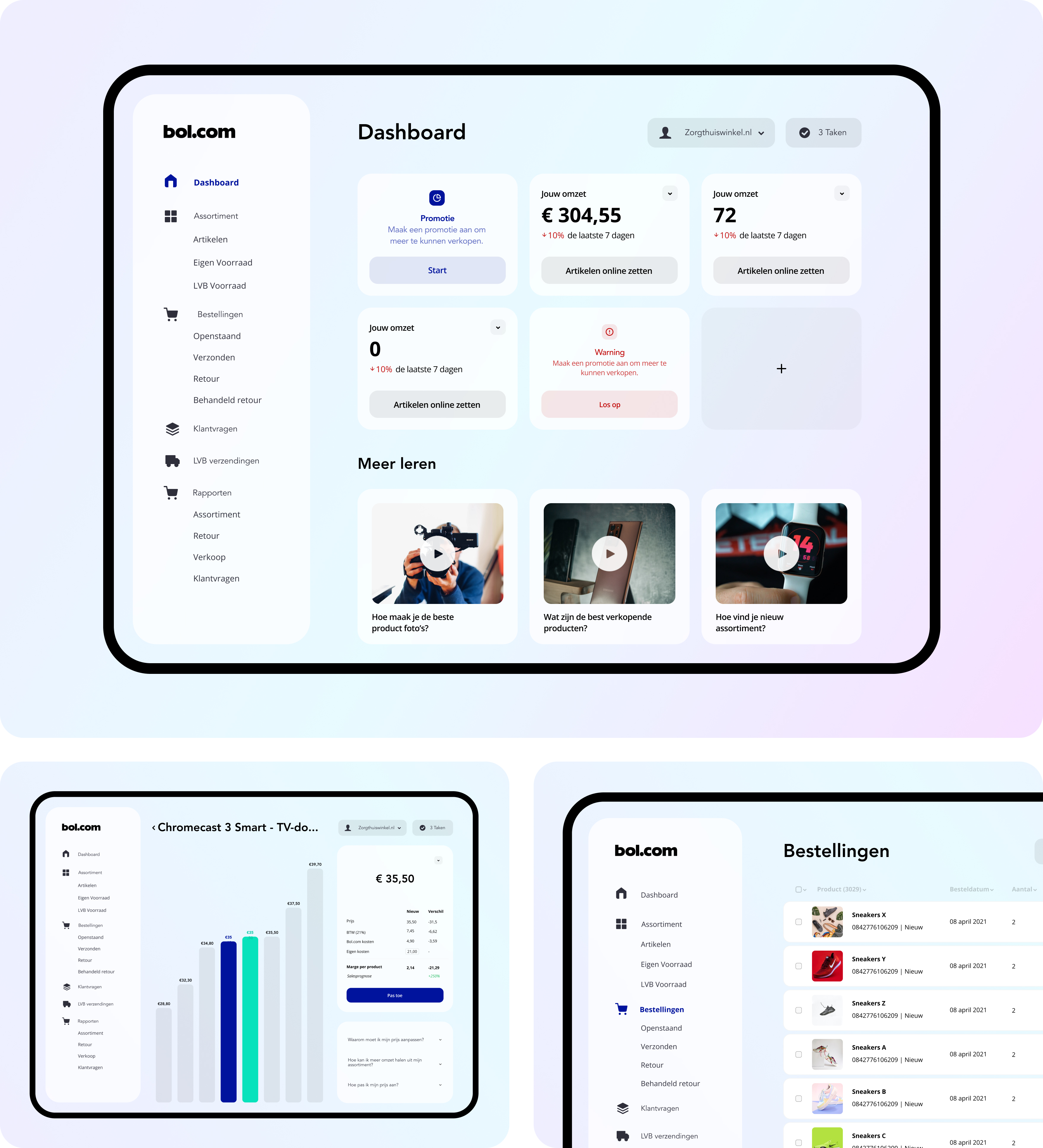
Our journey commenced with a revolutionary alteration to Bol.com's approach to customer interaction. Through immersive User Research conducted via a series of Design Sprints, we unearthed a crucial insight—the user's experience was hindered by data relevance limitations, especially for those with smaller product portfolios. This revelation ignited the creation of interactive cards, intelligently guiding users to pertinent information. These cards also offered the flexibility to tailor the dashboard to personal preferences. Given partners' unique data needs, the static previous dashboard was transformed, becoming accessible and effective for a broader range of users.
User-Centric Content Delivery:
Another pivotal realization surfaced—the necessity for early-stage information provision during the user journey. Frequently, valuable content remained obscured, detached from its context. This issue reflects a common trend, where user-centric content is overlooked due to insufficient User Research. Our intervention addressed this gap, delivering a solution that puts pertinent information at the forefront.
Simplifying the Complex:
We tackled the intricate menu structure, which presented an overwhelming array of around fifty pages, each leading to distinct pathways. Our strategy involved streamlining this complexity, rendering redundant pages obsolete, thereby enhancing the user experience for both partners and internal teams.
Enhancing Pricing Information Dissemination:
Post-Design Sprint deliberations revolved around pricing information presentation. Our chosen sketch transitioned into a prototype, offering clear visual cues that guided partners through vital pricing data. Unlike the previous text-heavy approach, our prototype offered partners a contextual understanding of pricing data, streamlining their decision-making process.
The Process:
Our navigation of the partner platform unveiled diverse stakeholder interests, from the partners themselves to the management team. Yet, the pursuit of alignment often resulted in stagnation.
A. Investigation:
Data analysis commenced our process, uncovering insights from customer service notes. Stakeholder interviews and a Design Sprint enriched our understanding, while drawing inspiration from successful solutions broadened our perspective.
B. Planning:
This phase involved establishing long-term objectives and mapping user stories and flows. The resulting expansive flowchart charted the user's journey.
C. Exploration:
Our creativity took flight, striving for a matchless user experience. This pursuit culminated in a holistic system where design speaks instantaneously to users.
D. Communication:
Effective design is effective communication. Complex data finds expression through user-friendly interfaces and interactions. This phase focused on mastering the language of the user.
Activities:
• Development and Honing of Design System
• Ideation and Wireframing
• Rigorous User Testing and Validation
• Meticulous User Interface Design
• Iterative Prototyping for Continuous Enhancement
• Leadership in Recruitment, Onboarding, and Mentoring of UX Designers
How it was:
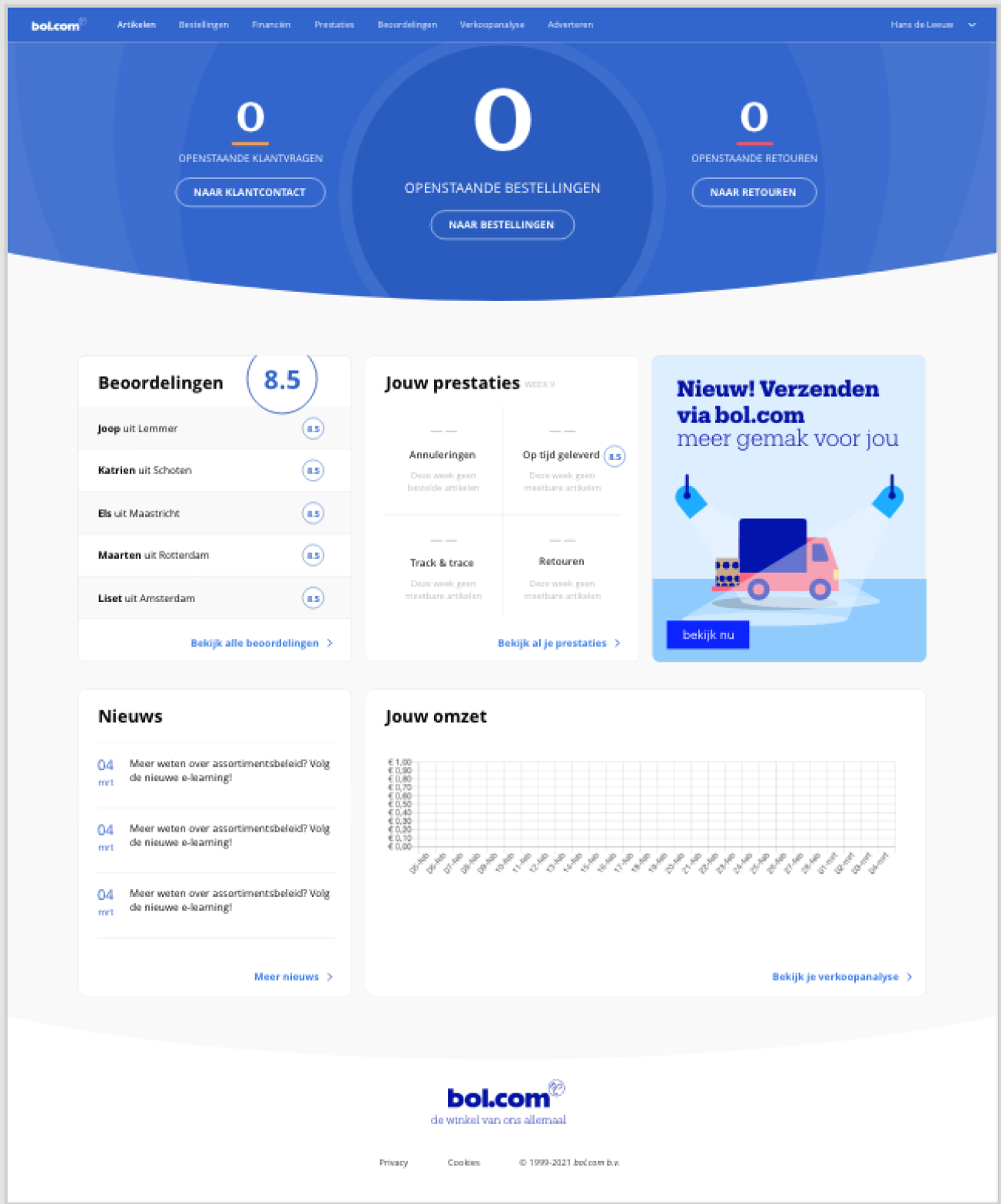
This is how the platform looked like. This is how they have been running their business for quite some time already. But as you maybe can see, the information is not structured and gives a complex feeling.

Their menu was a whole different story. I don’t have a picture anymore from the menu folded out. But it was loaded with pages. I think there were around fifty pages all leading to a certain flow. It was quite a mess. But nothing I can’t fix! The only problem was that all the teams within Bol.com had their own page. Theb suddenly you make a smart design move and their entire page is not neccesary anymore. Which is a dificult decision but eventually best for everyone. So thats how I designed the following:

Which was much more categorized and easier to navigate.
After we did a Design Sprint on how we should display our pricing to our partners, this was the winning sketch:

Which concluded in a small prototype where we visually guided the user with prominent visual indicaters that show the information that the user actually helps. Previous teams build it in such a way that they were explaining it through text. But in the Design Sprint, I designed a prototype where the prices of all the other partners are also visable. So that in that way, user have a 100% more of an understanding why they should price that way.

Het Process
Er speelde enorm veel belangen bij het partner platform. Waren het niet de partners zelf was het wel het management team. Maar je komt nergens als je iedereen tevreden wilt stellen.
A. Investigate.
Dus daarom is het altijd verstandig om te beginnen met data! Wat voor data is er allemaal? Wat bij deze opdracht goed hielp was om alle notities van de klantenservice door te lezen. Er was namelijk al zo veel. Vervolgens interviewde ik de stakeholders en uiteindelijk in een Design Sprint de klant zelf. Daarnaast was ik ook bezig om te kijken of ik goede voorbeelden kon vinden van oplossingen die dit op een succesvolle manier weten op te lossen.
B. Plan.
Bij deze fase was ik bezig met het stellen van een langer termijn doel en het plotten van user stories en user flows wat uitliep in een giga flowchart van waar de gebruiker allemaal wel niet mee te maken krijgt. Dit is altijd zo enorm belangrijk.
C. Explore.
Hier mag mijn creativiteit altijd eventjes helemaal los en los ging ik. Ik wilde namelijk de gebruiker op de meest efficiëntste manier tot dienst zijn. Ik zocht naar een systeem wat in zijn geheel klopt. Wat voor de gebruiker in 1 opslag duidelijk is omdat het design voor zichzelf spreekt.
D. Communicate
Communicatie is het aller belangrijkste onderdeel van het geheel. Uiteindelijk is Design communicatie van vrij complexe cijfertjes naar een knop waarmee je communiceert. Maar wat in deze fase belangrijk was was de taal van de gebruiker leren te begrijpen.
Activities
• Design System
• Wireframing
• User Testing
• User Interface Design
• Protoyping
• Hiring, onboarding and coaching of UX Designers
Link
bol.com